Premise 1. If an asset’s price goes down during a crisis, then that asset is not a “safe haven.”

Premise 2. Bitcoin’s price went down during a crisis.

Therefore:

Conclusion 3. Bitcoin is not a safe haven.
Evaluation:
Premise 1. “If an asset’s price goes down during a crisis, then that asset is not a ‘safe haven.’” Dubious. By this definition, every asset has the potential to lose its “safe haven” status (if its price goes down – even “temporarily” – during a crisis), which should strike the reader as “obviously flawed” and most definitely not a useful label.
In fact, the claims that an asset “is or is not a safe haven because of its price movements [in the short term]” are all subject to the “no true Scotsman fallacy,” also known as an “appeal to purity.” If, with each new economic “crisis,” a pundit can change the timeline, the loss or gain threshold, or some other criteria to classify an asset as either “safe haven” or not, then such an argument is invalid and such a definition is unusable.
A much stronger approach would be to define a “safe haven” by the overall nature of how money flows into and out of the asset throughout its entire lifetime, and NOT update the definition of a “safe haven” with each new “crisis.” See below.
Premise 2. “Bitcoin’s price went down during a crisis.” Agree, lol.
Therefore:
Conclusion 3. “Bitcoin is not a safe haven.” Disagree. This Argument, because of Premise 1, is not sufficient to establish the conclusion that “Bitcoin is not a safe haven asset,” but it’s possible that other Arguments would be sufficient to establish this claim.
Risk Assets vs. Safe Haven Assets
The beauty of “the markets” is that they capture the size and strength of everyone’s opinions, all over the world, at all points in time: all the lovers and haters of an asset, all of the PhD economists and the high school dropouts, all of the professional hedge fund managers and the amateurs with a hunch – everyone’s opinions are constantly and consistently captured in the price of an asset.
The price of an asset, therefore, signals the “revealed preferences of the aggregate” over time, and if we look at a long-enough time horizon, we can see how generations of individuals (and institutions!) around the world view a particular asset.
So what types of price movements do we see?
As you might expect, we see two broad types of price movements:

- One type of asset “inches” upward most of the time, experiences a rounded top, and a quick downward spike during its “corrections.” Then the pattern repeats, and it does so relatively quickly and frequently. This type of asset enjoys long bull markets and short bear markets. Notably, the absolute largest single-day movements of all time are actually downward.
- The other type of asset typically moves downward or sideways most of the time, experiences a rounded bottom, and a quick upward spike during its “corrections.” This pattern repeats very slowly and infrequently, but the magnitude of the movements is much greater. This type of asset endures long bear markets and short bull markets. Notably, the absolute largest single-day movements of all time are upward.
The two types of assets described above are risk assets and safe haven assets, respectively.
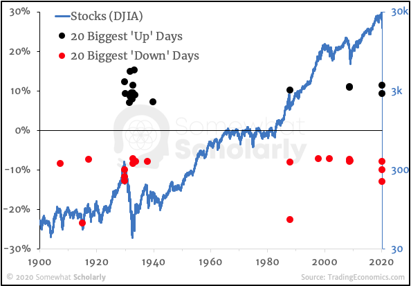
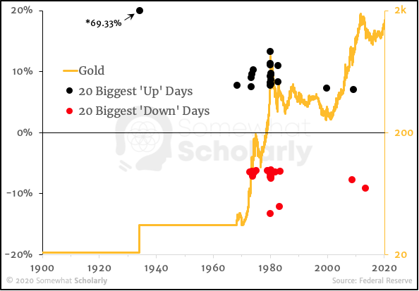
Here is a chart illustrating the prime example of each asset type – stocks and gold:
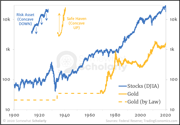
Notice that Stocks exhibit a repeating pattern of steady uphill climb, rounded top, and quick spike down. Then the pattern repeats. Gold, on the other hand, exhibits a pattern of flat movement, then a rounded bottom, and a quick spike up.
Interestingly, there's another important pattern that emerges, but it's only apparent when we analyze the numbers more deeply: in a risk asset, the biggest single-day moves (up and down) tend to occur during a bear market, whereas in a safe haven asset, the biggest single-day moves (up and down) tend to occur during a bull market:
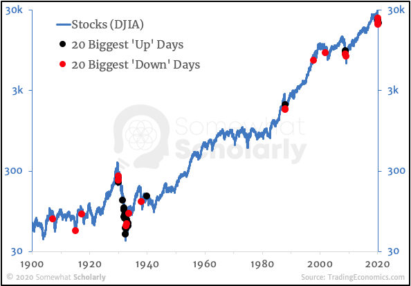
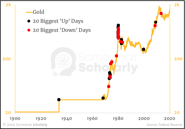
In other words, big record-breaking single-day volatility is typically a sign of a bear market for risk assets, and a bull market for safe haven assets.
For those curious of the magnitudes of each single-day move, here’s the same information with the magnitude of the daily change (%) plotted on the left axis:
What about Bitcoin?
Of course, we don’t have the luxury of a 120-year price history, so we’ll have to suffice with just 10 years.
Here’s Bitcoin’s price history with the 10 largest one-day price moves up and down. [Note that I’ve highlighted only the 10 biggest days, not 20, since the price history is so much shorter]:
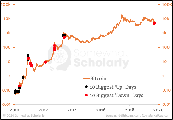
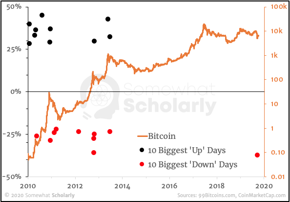
As you can see, the biggest one-day moves tend to occur during a bull market, just like a safe haven.
While the timing of big moves is interesting, it’s not our primary criterion for establishing an asset as a safe haven.
Instead, let’s look at the shape of Bitcoin’s overall price trajectory, and compare it to Gold’s price trajectory since it became “freely traded” in April 1968 (after the collapse of the London Gold Pool):
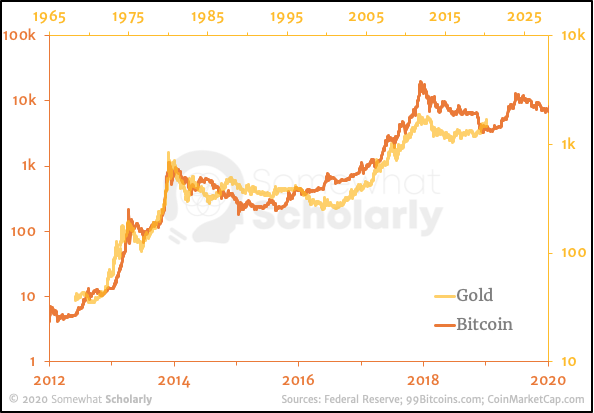
You’ll notice that I’ve slightly adjusted the horizontal time scales to highlight the staggering similarity in the shape of their price trajectories over time.
Here’s the same time comparison between Bitcoin and Stocks:
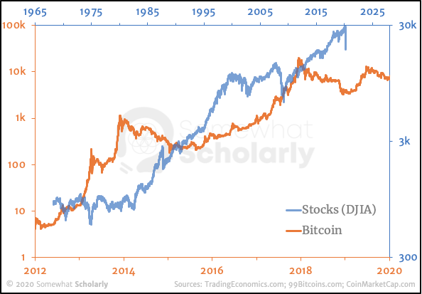
As you can see, Bitcoin and Stocks are not even close to moving in a similar way.
Key Takeaway
Remember, we’re defining a “safe haven” based on the overall behavior of every person in the world – including those who bet for an asset, against an asset, and those who sit on the sidelines.
We’re not interested in what people say about an asset – only in how people actually act.
The collective behavior of the market reveals that people largely ignore Bitcoin and Gold on a day-to-day basis (while instead focusing on Stocks or other “risk assets”), and then, occasionally, they flip their focus – rushing out of Stocks and into Bitcoin and Gold.
For these reasons, Bitcoin is a safe haven asset, just like gold.
Have I missed something? I welcome your constructive criticism and your evaluation of my Arguments.

